

Your business might have a recognisable logo, matching workwear and a well-designed website, while your work van remains anonymous. If you want to make a white van look more professional, a few considered changes can help connect it to your business.
From vinyl lettering to carefully positioned graphics, the right approach depends on your branding, available space and customer needs.
This guide explains how to improve your van’s appearance, choose suitable graphics and create a coordinated design without overcrowding the vehicle.
Start With the Information Your Van Actually Needs
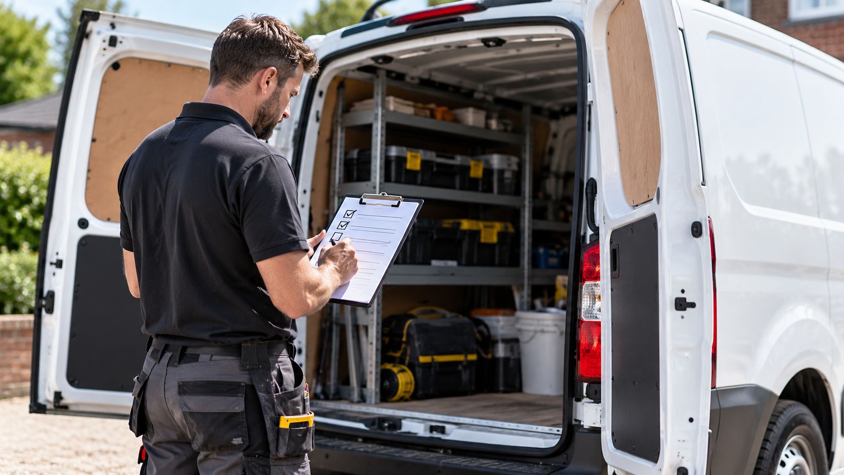
A professional business van should tell potential customers who you are, what you do and how to contact you. Clear information matters more than filling every available panel.
Start with your business name or logo, followed by a short description of your main service. Choose one or two contact methods, such as a phone number or website.
For example, a plumber could display their company logo, “Plumbing and Heating” and a website address. A lengthy list of repairs, installations and maintenance services would make the design harder to read.
Prioritise these details:
- Essential: Business name, logo and main service.
- Useful: Phone number, website or service area.
- Avoid: Long service lists, multiple social media handles and unnecessary slogans.
Well-positioned vinyl lettering can present this information clearly without covering large sections of your van.
Check that someone passing your vehicle can identify your business at a glance.
Decide How Much of the Van You Actually Want to Brand
You do not need to cover every panel to make a white van look intentionally branded. Lettering or selected graphics can provide enough visual identity when the layout makes effective use of the available space.
Consider the type of business, its existing identity and how customers encounter the vehicle.
When Simple Lettering May Be Enough
A local electrician might only need a business name, trade description and contact details. Clear lettering against white paint can communicate these essentials without introducing unnecessary decoration.
This approach suits businesses with restrained branding or owners who prefer a more understated appearance.
When Stronger Graphics May Make Sense
A vehicle detailing company with a distinctive logo and established colour scheme might benefit from larger graphics across selected side panels.
The additional design elements can reinforce its visual identity, particularly when the vehicle is regularly seen at customer premises.
| Restrained lettering | More prominent graphics |
| Focuses on business identification | Gives greater emphasis to visual identity |
| Uses fewer design elements | Allows larger logos and graphic shapes |
| Keeps more bodywork visible | Uses selected panels more extensively |
| Suits understated branding | Suits businesses with distinctive branding |
Neither approach is automatically more professional.
The existing white paint can serve as negative space, giving lettering room to breathe. Before choosing extensive coverage, consider whether a smaller design would communicate everything required.
Demon Graphics’ range of vehicle graphics and car stickers offers a useful starting point for exploring different treatments.
Keep the Colours and Design Consistent With Your Business
Your van should reflect the branding used across your website, workwear and other business materials. Consistent colours, logos and fonts create a coordinated appearance.
For example, a business using black and red branding should avoid introducing unrelated colours simply to fill empty panels.
Before finalising your design, check:
- Logo: Keep it recognisable and correctly proportioned.
- Colours: Choose shades that complement your existing branding.
- Lettering: Use consistent fonts with clear contrast against white paint.
- Layout: Leave enough space between design elements.
Your van’s white bodywork can complement the graphics without needing additional coverage.
Make Sure the Van Itself Looks Well Maintained
New graphics cannot disguise a poorly maintained van. Clean bodywork, tidy trim and well-kept wheels help create a professional appearance.
Before applying graphics, check for:
- Bodywork: Remove dirt and inspect scratches or peeling paint.
- Wheels: Clean wheel trims and replace damaged components.
- Exterior fittings: Check for loose handles, broken trim or damaged panels.
- Application surfaces: Ensure areas intended for lettering are clean and suitable for adhesive vinyl.
Fresh graphics can highlight nearby damage rather than conceal it. Address visible issues before installation.
Once fitted, clean graphics gently and avoid directing high-pressure water at their edges.
Use the Van’s Shape Rather Than Fighting Against It
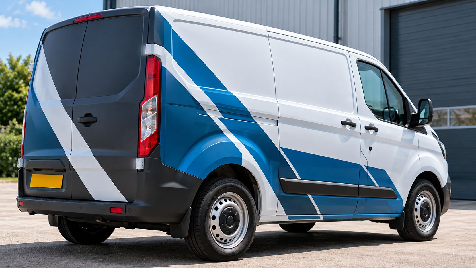
Professional vehicle graphics should complement your van’s shape, working around doors, handles, windows and body panels. A design that looks balanced on screen may appear different once applied.
Consider these areas before choosing graphic placement:
- Sliding doors: Ensure important lettering remains readable when doors open.
- Door handles: Keep logos and contact details clear of handles and recesses.
- Panel gaps: Avoid splitting telephone numbers or website addresses across openings.
- Wheel arches: Position graphics where curves will not distort their appearance.
- Rear doors: Check how lettering aligns when both doors are closed.
For example, placing a phone number across a sliding door could interrupt its readability.
Photograph your van from both sides and the rear before planning your layout. Record its make, model and body length, as these affect available space.
Careful positioning helps graphics look intentional while keeping essential business information clear and accessible.
Avoid Overcrowding the Van’s Design
A professional van should display essential information without overwhelming the viewer. Excessive text, contact details and graphics can make your branding difficult to understand.
Instead of listing ten services and multiple contact methods, prioritise your logo, core service and one clear contact route.
Keep these principles in mind:
- Hierarchy: Make your business name most prominent.
- Spacing: Leave enough white space between elements.
- Readability: Avoid small lettering and crowded layouts.
- Placement: Consider how the design looks across the entire vehicle.
If you need inspiration, explore these creative ways to use car stickers for business branding while keeping your essential information at the centre of the design.
What Should You Do Before Ordering Van Graphics?
Before ordering van graphics, confirm your business details, artwork and vehicle measurements. Accurate information helps avoid design errors and unsuitable placement.
Follow this checklist:
- Confirm your details: Check your business name, phone number, website and service description.
- Check your artwork: Provide a clear logo file, preferably in vector format.
- Identify your vehicle: Record its make, model, year and body length.
- Measure available space: Account for handles, panel gaps, windows and wheel arches.
- Review the layout: Check lettering size, colour contrast and visibility from different angles.
- Approve the design: Confirm spelling, proportions and placement before production.
Photographs of your van can help explain your preferred layout and highlight potential fitting issues.
If you’re unsure about sizing, artwork or placement, contact Demon Graphics to discuss your requirements before ordering.


