

Black cars offer one of the best canvases for custom graphics because almost any colour can contrast well against dark paint. The best choice depends on the look you want, whether that is premium, sporty, aggressive or subtle.
If you are searching for the best stickers for a black car, colour alone is only part of the decision. Contrast, finish, material and placement all affect how the graphic looks once it is on the vehicle.
At Demon Graphics, we often find that the best styling decisions come from understanding why a colour works, not simply choosing the brightest option.
What Makes a Sticker Colour Stand Out on a Black Car?
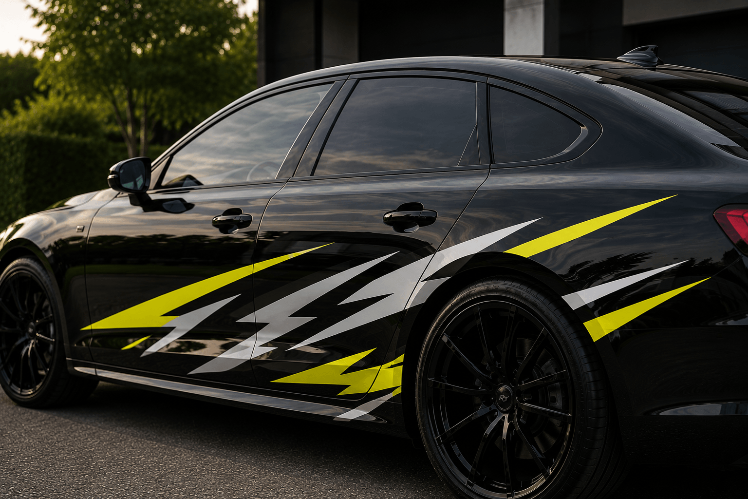
Strong contrast usually comes from brightness difference, reflective finish or bold colour saturation.
Black paint naturally creates contrast, but visibility depends on more than brightness.
The main factors are:
- Light versus dark contrast
- Reflective properties
- Colour saturation
- Graphic size and placement
- Surface finish
For example, matte grey can still stand out on gloss black because texture changes how light is reflected. Chrome behaves differently again because visibility comes from reflection rather than pigment.
This is why learning how to colour-match car stickers helps avoid combinations that clash rather than complement.
White Car Stickers on Black Cars
White offers the sharpest visual contrast on black paint, making it one of the easiest colours to notice from a distance.
White graphics create crisp definition.
This makes them especially effective for:
- Motorsport stripes
- Side graphics
- Window banners
- Text-heavy decals
White also tends to look clean and modern rather than flashy.
If readability matters, white is usually one of the safest choices.
Red Vehicle Graphics for Bold Contrast
Red creates an aggressive, performance-focused look that works especially well on sporty cars.
Red has strong motorsport associations.
It suits:
- Hot hatches
- Track builds
- Brake-accent styling
- Race-inspired graphics
Red works particularly well when matched with existing styling details such as brake calipers or interior stitching.
Used well, it feels purposeful rather than loud.
Silver Decals for a Premium Finish
Silver gives black vehicles a refined contrast without looking too loud.
This is one of the most versatile premium-looking options.
Silver works because it adds visibility while remaining understated.
It often suits:
- Executive saloons
- Luxury SUVs
- OEM-inspired side graphics
- Badge detailing
Metallic silver usually feels more expensive than flat grey or plain white.
Gold Vinyl Stickers for Luxury Styling
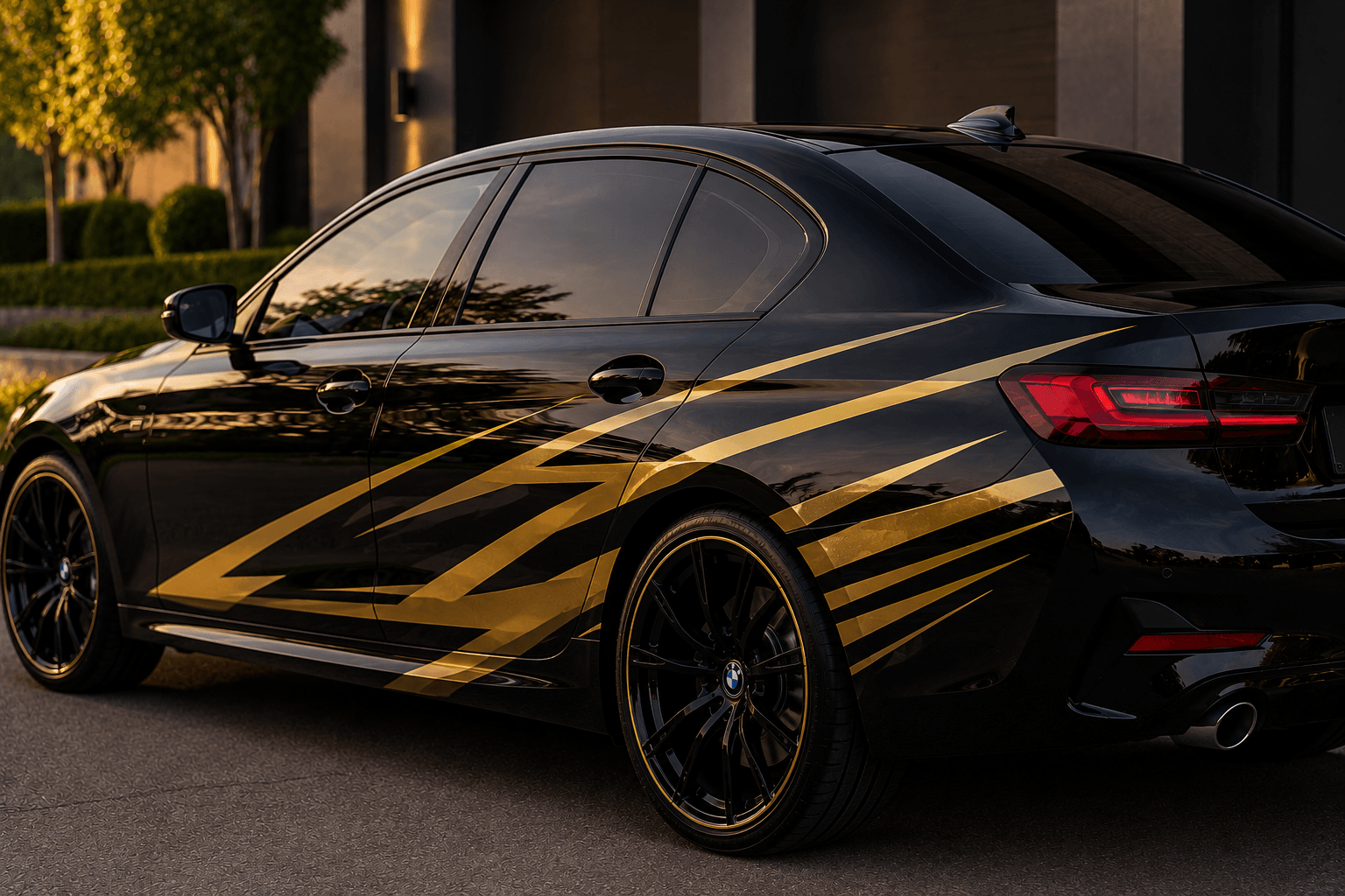
Gold works best when used sparingly for luxury-inspired contrast. Gold can look striking on black paint, but restraint matters.
Small gold accents often work better than large graphics.
Popular uses include:
- Badge decals
- Wheel detailing
- Script graphics
- Pinstripes
Too much, though, and it can quickly become overpowering.
If you are exploring premium car stickers, gold usually works best as an accent rather than the main feature.
Neon Green Graphics for High Visibility
Neon green delivers one of the boldest visibility contrasts possible on black paint.
This colour creates immediate visual impact.
It suits:
- Modern performance builds
- Track-day cars
- Aggressive styling themes
Neon green is not subtle, but that is often the point.
For enthusiasts wanting maximum presence, few colours stand out more.
Blue Car Stickers for a Modern Look
Blue creates a cleaner, more modern contrast than brighter, aggressive colours. Blue often feels cooler and more technical.
Electric blue adds energy, while darker metallic blues feel more refined.
Blue suits drivers wanting something eye-catching without the intensity of red or neon.
It works especially well on modern EVs and performance saloons.
Yellow Vehicle Decals for Motorsport Styling
Yellow creates strong motorsport energy while remaining highly visible.
Yellow carries a strong racing heritage.
It works particularly well for:
- Number graphics
- Racing stripes
- Side sill decals
- Sponsor-style logos
Against black paint, yellow delivers a strong contrast while feeling energetic.
Orange Graphics for a More Aggressive Appearance
Orange adds warmth and aggression, making black cars feel more track-focused.
Orange has become increasingly popular in modern supercar styling.
It adds energy without feeling as harsh as neon tones.
Orange works well for:
- Accent stripes
- Mirror details
- Lower sill graphics
It creates a more modern, aggressive aesthetic.
Chrome Stickers for Reflective Contrast
Chrome decals stand out through reflection rather than pure colour contrast.
Chrome behaves differently from standard colours.
Instead of relying on brightness alone, it changes appearance depending on the surrounding light.
That makes chrome feel premium when clean and carefully used.
When Chrome Becomes Too Much
Chrome can look excessive if overused.
Large chrome graphics often reflect too much light and start feeling flashy rather than refined.
Smaller accents usually work better.
If you are comparing finishes, understanding gloss vs matte finishes can help clarify whether reflective styling suits your vehicle.
Matte Grey Vinyl for a Subtle Finish
Matte grey offers understated contrast for drivers who want subtle styling.
This is one of the most overlooked options.
Matte grey works particularly well on:
- Gloss black cars
- Satin black builds
- Stealth styling themes
The result is contrast without shouting for attention.
In our experience, matte grey often creates one of the most premium finishes.
Pink Car Decals for a Standout Custom Look
Pink delivers another strong contrast and works well for expressive, highly personalised builds.
Pink is increasingly popular in custom culture and social-media-focused builds.
It makes a strong visual statement and suits buyers who want unmistakable individuality.
This is not a subtle option, but it is effective when statement styling is the goal.
Which Sticker Colours Can Look Cheap on Black Cars?
Poor colour combinations usually look cheap because of execution, not colour alone.
Even strong colours can look poor if styling choices are inconsistent.
Common mistakes include:
- Using too many colours together
- Choosing low-quality metallic film
- Mixing finishes without a clear theme
- Poor colour matching with the existing trim
The biggest mistake is chasing contrast without considering overall styling balance.
In most cases, premium styling comes from restraint.
The best stickers for a black car depend entirely on the look you want.
White offers the strongest contrast. Red, yellow and neon green create aggressive motorsport energy. Silver, chrome and matte grey usually deliver the most premium finish.
Colour matters, but finish and placement matter just as much.
If you are unsure which colour or finish suits your black car best, feel free to contact us at Demon Graphics for tailored styling advice.


