

The best places for van graphics depend on what your business needs to communicate and how people usually see your vehicle. Side panels provide room for prominent branding, while rear doors suit concise contact information. Smaller areas can support the overall design.
Choosing where to put graphics on a van involves more than finding available space. Door openings, bodywork, windows and viewing angles all influence how clearly your message comes across.
A well-planned layout gives each area a purpose without covering every panel.
Side Panels: Best for the Main Brand Identity
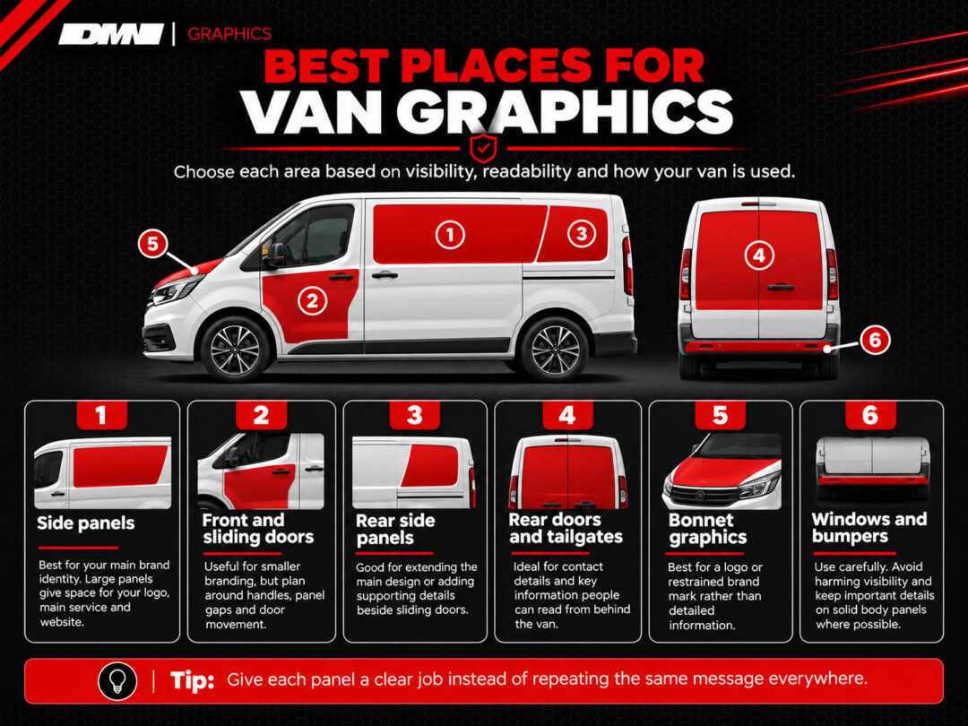
Side panels are usually the best place for your van’s main branding because they offer large, visible surfaces. They allow your business name, logo and primary services to be recognised when parked or travelling.
For example, a landscaping company could use car stickers to display its logo alongside a short service description and website address.
Before planning the layout, consider:
- Wheel arches: Keep lettering away from curved sections.
- Body lines: Position graphics around existing contours.
- Door handles: Avoid placing important details behind fittings.
- Viewing angles: Make essential information readable from the roadside.
Choose a layout that suits your van’s proportions. Leaving space around key details can improve clarity without sacrificing branding.
Front and Sliding Doors: Useful, but Design Around Movement
Van doors offer valuable branding opportunities, provided the design accounts for handles, panel gaps and opening mechanisms. Graphics should remain understandable during everyday vehicle use.
Front Doors
Front doors suit smaller versions of your business identity, particularly when the main side panel already carries larger graphics.
A compact logo, company name or website can work without making the door appear overcrowded.
Check both sides of the vehicle before finalising placement. Fuel filler positions, handles and surrounding panels may affect the available space.
Sliding Doors
Sliding doors need additional planning because their position changes throughout the working day.
A graphic spanning the sliding door and adjacent bodywork might appear continuous when closed, then become interrupted when opened.
Avoid placing your only phone number or website across this boundary.
Keep essential lettering within individual panels wherever practical. If graphics extend across multiple sections, check how the design looks with the door both open and closed.
Rear Side Panels: Useful for Extending the Main Design
Rear side panels are useful for extending your van’s branding or displaying supporting information, especially when sliding doors divide the available space.
A landscaping business could position its logo on the main panel, using the rear section for its website or service details.
Check wheel arches, body lines and door tracks to avoid interrupted lettering.
Thoughtful placement is one way of how car stickers can boost your local business, keeping your branding consistent and important information easy to read.
Rear Doors and Tailgates: Prioritise Information That Works From Behind
Rear doors and tailgates are valuable for displaying business information to people behind your van, whether in traffic or while parked.
Prioritise your logo, main service and contact details. Clear lettering and adequate spacing make information easier to read without overcrowding the design.
Vans With Split Rear Doors
Split rear doors need careful planning because the central gap interrupts the available surface.
Keep telephone numbers, websites and important wording together on individual panels. Check handles, hinges and windows before deciding on placement.
Vans With Tailgates
Tailgates may offer more continuous space for branding, depending on their shape and window arrangement.
Position key information on suitable bodywork, keeping graphics clear of lights, registration plates, cameras and sensors.
If your design mainly features business names, websites or contact details, Demon Graphics’ vinyl lettering is worth considering for a clean, readable layout that suits your vehicle.
Bonnet Graphics: Better for Branding Than Detailed Information
Bonnet graphics work best as supporting branding rather than a location for detailed business information. A logo, brand mark or restrained graphic can complement the main design.
Bonnet shape, curvature and viewing angle make longer messages less practical.
A small company emblem might suit a van with established side and rear branding. Adding telephone numbers or lengthy service descriptions is less useful.
Consider leaving the bonnet unbranded if the existing graphics communicate everything necessary.
Rear and Side Windows Need More Careful Consideration
Van windows require greater care because graphics can affect visibility and must comply with applicable vehicle requirements. Body panels are generally a more straightforward choice for essential business information.
Rear Windows
Rear windows may accommodate supplementary branding where suitable, although visibility, wipers, heating elements and the vehicle’s equipment need consideration.
Avoid assuming a graphic is appropriate simply because space appears available.
Side Windows
Side-window placement depends on the vehicle’s configuration and the driver’s required field of vision.
Graphics must not interfere with safe observation or applicable roadworthiness requirements.
Where uninterrupted metal panels are available, placing important contact information there avoids unnecessary complications.
Bumpers Are Usually Supporting Space, Not the Main Message
Bumpers generally provide less practical space for business graphics than larger body panels. Their shape and surrounding vehicle features make detailed information difficult to position effectively.
Sensors, reflectors, lights and curved surfaces can further restrict placement.
A small decorative element may complement existing branding where appropriate. However, essential contact details belong somewhere more readable.
Leaving bumpers untouched can also help maintain a cleaner overall appearance.
How Should You Choose the Best Areas for Your Van Graphics?
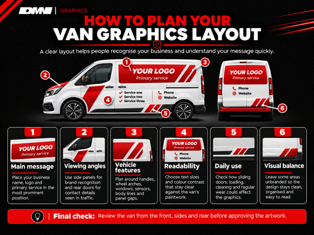
The best areas for van graphics depend on your vehicle’s shape, how customers see it and the information you want to communicate. Each panel should serve a clear purpose rather than carrying the same message.
Before finalising your design, consider:
- Main message: Give your business name, logo and primary service the most prominent positions.
- Viewing angles: Use side panels for brand recognition and rear doors for contact details visible in traffic.
- Vehicle features: Plan around handles, wheel arches, windows, sensors and panel gaps.
- Readability: Choose lettering sizes and colour combinations that remain clear against the paintwork.
- Daily use: Check whether sliding doors, loading equipment or regular cleaning could affect the graphics.
- Visual balance: Leave suitable areas unbranded to prevent the design becoming cluttered.
Review the proposed layout from the front, sides and rear. Check whether someone unfamiliar with your business could identify what you offer without reading every detail.
Measure the available surfaces before ordering, particularly where curved panels could affect lettering placement.
If you need guidance on positioning graphics around your van’s features, contact us to discuss your requirements and suitable design options.


