

Premium-looking car stickers rarely shout for attention. The best designs look intentional, well-fitted and almost factory-installed.
If you are searching for stickers to make your car look premium, the biggest mistake is focusing only on the design. In reality, finish, placement, scale and colour choice matter just as much as the graphic itself.
At Demon Graphics, we often find that the best-looking upgrades are subtle. Small changes that work with the vehicle’s original design usually age far better than oversized decals or aggressive graphics placed without a clear theme.
Here below are the sticker styles that consistently create a more refined look.
Gloss Black Vinyl Accents
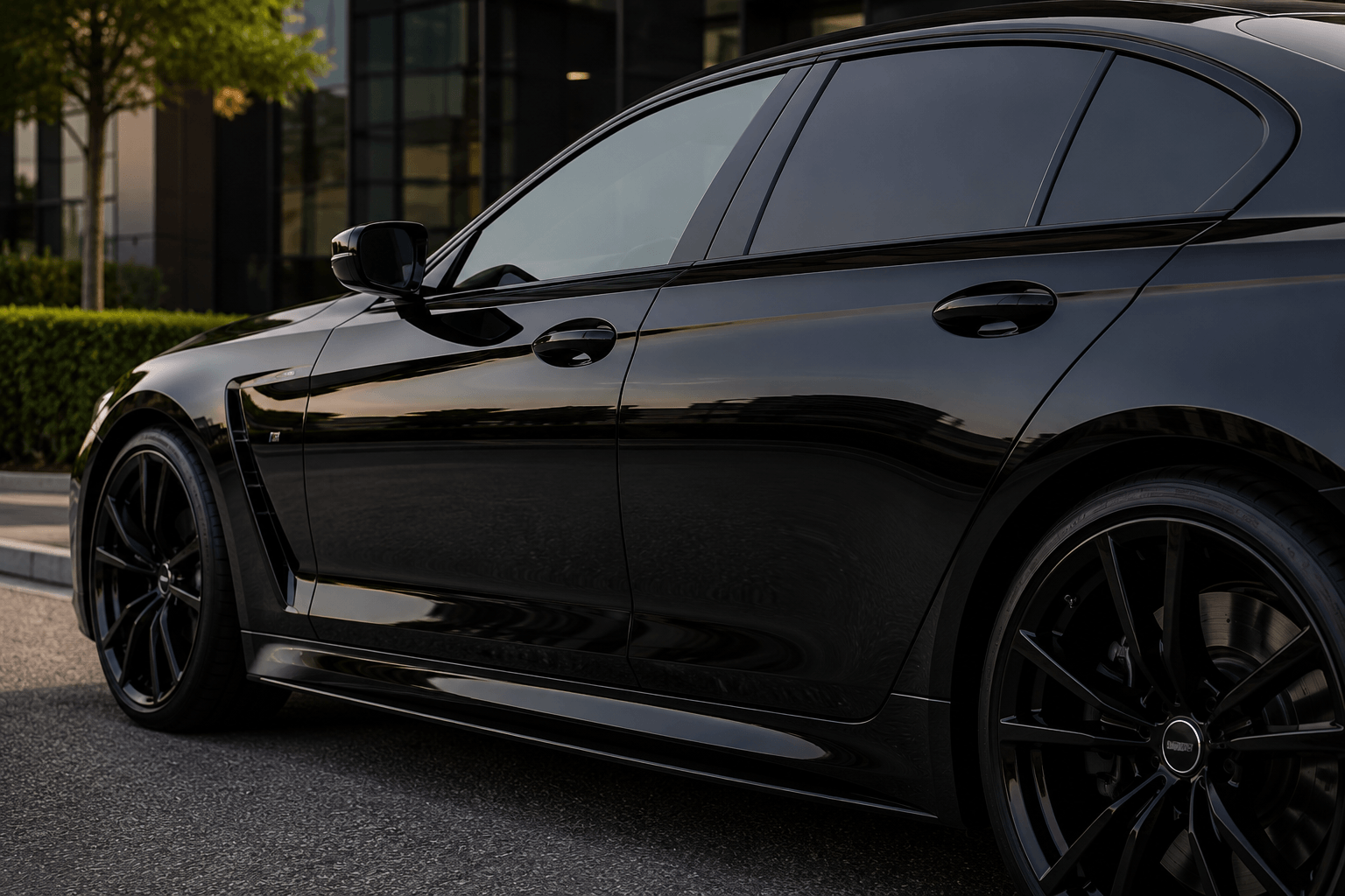
Gloss black accents work because they mirror factory trim found on many modern premium vehicles.
Manufacturers often use gloss black around windows, pillars and mirrors to create contrast and sharpen body lines. Matching that look with custom vinyl car stickers can make a car feel more expensive without changing its identity.
Popular gloss black placements include:
- Mirror caps
- Roof sections
- B-pillars
- Side trim strips
- Small spoiler accents
A white or silver car often benefits the most because the contrast is clean and deliberate.
Gloss black works best when used sparingly. Too many gloss sections can make the finish look busy rather than premium.
Matte Black Performance Graphics
Matte black creates a motorsport-inspired look without excessive shine.
Unlike gloss, matte absorbs light. That gives graphics a more understated presence while still adding visual aggression.
Popular choices include:
- Bonnet stripes
- Side stripes
- Lower sill graphics
- Rear quarter decals
When Matte Works Best
Matte black usually works best on lighter paint colours such as white, silver, blue and grey.
On black cars, matte can still work, but only if there is enough contrast to define the graphic. Otherwise, the detail can disappear entirely.
One common mistake is choosing matte because it feels “sporty” while ignoring the surrounding trim. If the car already has gloss black mirrors, trims and diffuser details, satin may blend better.
Pinstripe Detailing for a Subtle Finish
Thin pinstripes add definition without dominating bodywork.
Luxury cars have used pinstripes for decades because they highlight body contours rather than covering them.
A thin silver stripe on a dark grey car, for example, can sharpen shoulder lines and make the profile feel more sculpted.
The key is restraint; a stripe that is too thick stops looking refined and starts competing with the vehicle’s design.
Carbon Fibre Effect Stickers
Carbon-effect vinyl can look premium when used sparingly on trim pieces.
Small carbon-effect details can add texture and motorsport influence.
Good placements include:
- Mirror caps
- Diffuser trims
- Spoiler edges
- Interior trim panels
Where Carbon Effect Goes Wrong
Full bonnet wraps and oversized carbon panels often look artificial unless the car already has genuine carbon components.
In our experience, carbon effect works best as an accent, not as the main styling theme.
Minimalist Window Banners
Clean window banners can add personality without clutter.
A simple banner using thin typography or understated branding can look purposeful, especially on performance-focused builds.
Good banner design uses:
- Thin lettering
- Minimal logos
- Balanced spacing
- Clean font choice
Keep It Road Legal
Placement matters. A windscreen graphic that blocks too much visibility may create legal issues or MOT concerns. Always check UK visibility requirements before fitting a banner, however our guide on sun strip legality for your car will help you get it right first time.
OEM-Inspired Side Graphics
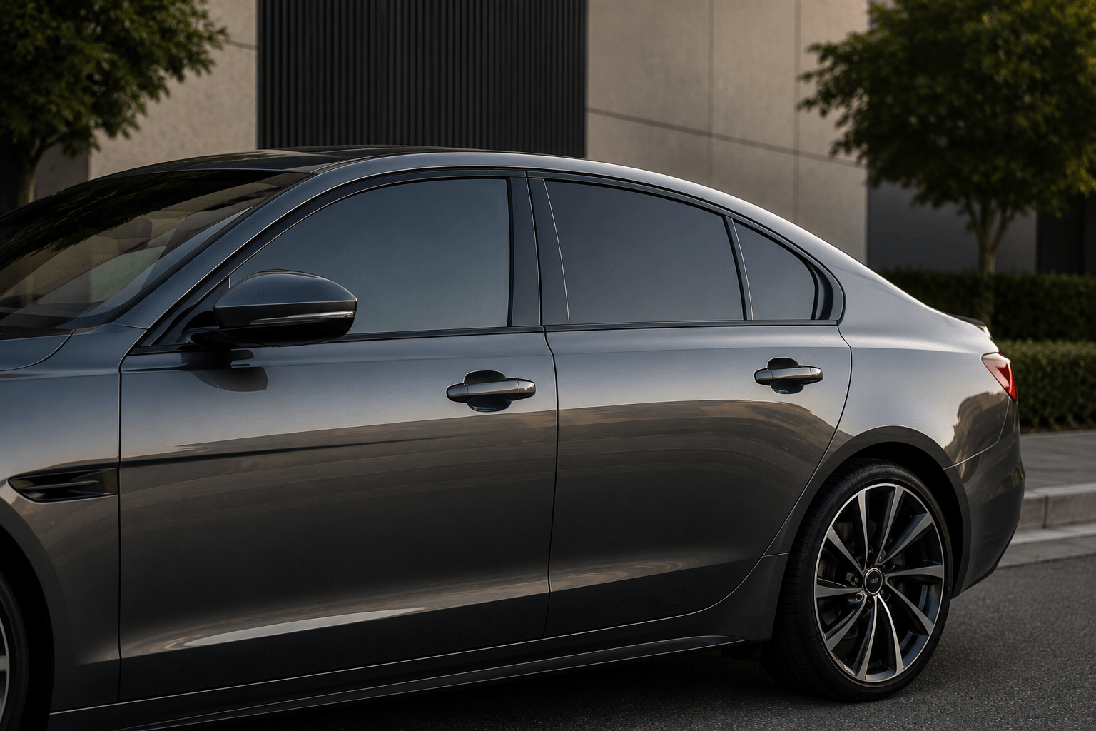
Factory-inspired graphics often look the most premium because they follow original design language.
This is where many aftermarket decals get it wrong. Premium graphics usually feel like they belong on the car.
Examples include:
- GT-style side stripes
- Performance model branding
- Motorsport heritage graphics
- Door sill lettering
Cars such as Porsche, AMG and BMW performance models often use subtle side graphics to reinforce identity.
OEM-style graphics work because they respect proportions, panel gaps and body lines.
That is why they tend to age better than trend-led sticker designs.
Reflective Vinyl Details
Small reflective details create subtle premium styling, especially at night.
Reflective vinyl adds visual interest without dominating daytime styling.
Popular uses include:
- Wheel rim accents
- Brake caliper branding
- Side sill details
- Rear bumper edge highlights
The premium effect comes from subtle visibility changes rather than obvious graphics.
Chrome and Metallic Decals
Metallic decals can look luxurious, but only when used with restraint.
Silver, brushed metal and soft champagne finishes often suit premium builds.
These finishes work especially well on:
- Dark blue cars
- Black cars
- Charcoal grey vehicles
When Chrome Looks Cheap
Chrome starts looking cheap when decals are oversized or highly reflective.
Large chrome graphics can overpower bodywork and attract attention for the wrong reasons.
Smaller metallic accents usually look far more refined.
Colour-Matched Vehicle Graphics
Colour-matched graphics usually deliver the most seamless premium finish.
Tone-on-tone styling creates a subtle visual effect that reveals itself in changing light.
For example:
- Dark grey on black
- Satin silver on white
- Deep blue on navy paint
This approach works because it enhances shape instead of introducing sharp contrast.
For more guidance on matching finishes and shades, see Demon Graphics’ guide to colour matching.
Satin Finish Car Stickers
Satin sits between gloss and matte, giving a refined, premium appearance.
This finish has become increasingly popular because it combines the best qualities of both.
Satin offers:
- Softer reflections than gloss
- More depth than matte
- Modern OEM-style appearance
If gloss feels too shiny and matte feels too flat, satin often becomes the ideal middle ground.
You can compare finishes in more detail with Demon Graphics’ guide to gloss vs matte car stickers.
Custom Lettering and Script Decals
Custom script works best when typography feels elegant and restrained.
Lettering can add personality, but premium styling depends heavily on font choice.
Strong options include:
- Clean sans-serif fonts
- Thin scripts
- OEM-inspired typography
Avoid Novelty Fonts
Novelty fonts are one of the quickest ways to make a car graphic feel cheap.
Large decorative text, heavy outlines and exaggerated lettering usually clash with modern vehicle design.
Keep lettering simple and correctly scaled.
What Makes a Car Sticker Look Cheap?
Poor execution matters more than the sticker itself.
Even a strong design can look poor if fitment or finish is wrong.
The most common mistakes we see are:
- Oversized decals
- Mixing too many finishes
- Poor alignment
- Cheap vinyl lifting at edges
- Random placement with no visual balance
In our experience, premium styling usually comes down to one principle: less is more.
A single well-placed graphic often creates a better result than multiple competing decals.
The best stickers to make a car look premium are rarely the loudest. They are the ones that complement factory styling, suit the paint colour and use the right finish.
Gloss black, satin vinyl, colour-matched graphics and OEM-inspired side stripes consistently create the most refined results because they feel intentional rather than aftermarket.
If you are unsure which finish or graphic style suits your vehicle, explore Demon Graphics’ premium decal range or contact us for tailored advice.


